Android design system
Our company had a great design for our iOS app, but our Android experience was lagging behind. On top of this, we were moving quickly as a company, and developments were happening with (or without) my input as a designer.
I was also working on a number of different projects (including a major web redesign) so I needed a way to communicate design direction to our mobile team and in a way that enabled them to make decisions about gaps in the design without my input.
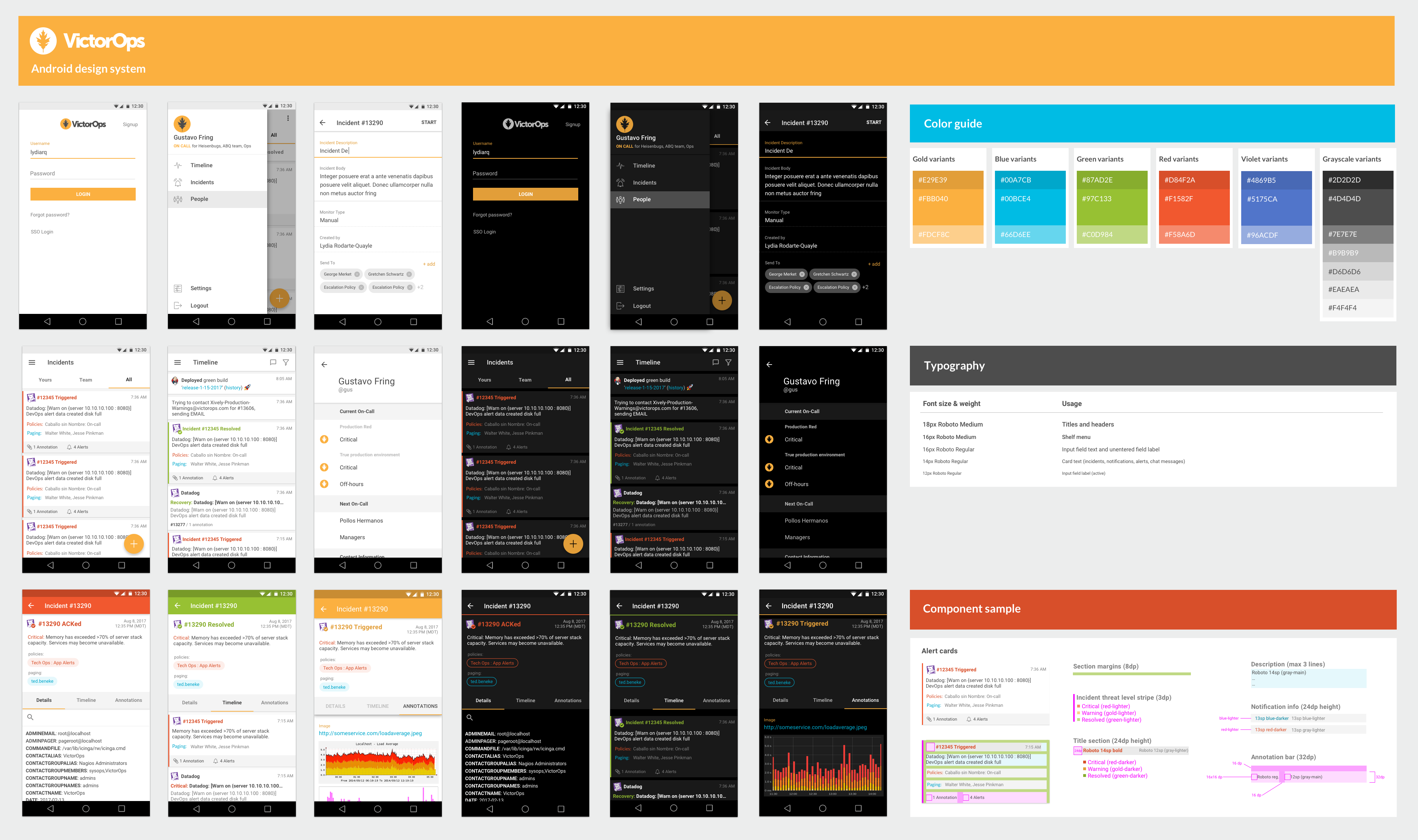
A sample of our Android design system
What is a design system, and why did we need one?
A design system is a collection of reusable components to tie an entire product together. A design system goes beyond simple styleguides and component libraries to provide a repeatable means of making decisions about how a particular part of the product should look or act based on said components.
This was useful in my team's situation, where I had limited time to provide screens for every product scenario, and needed to rely on my team to make design decisions.
Starting with sketches and wireframes
We knew that we wanted to use a recognizable Material design approach as we wanted the app to feel familiar and obvious to our users.
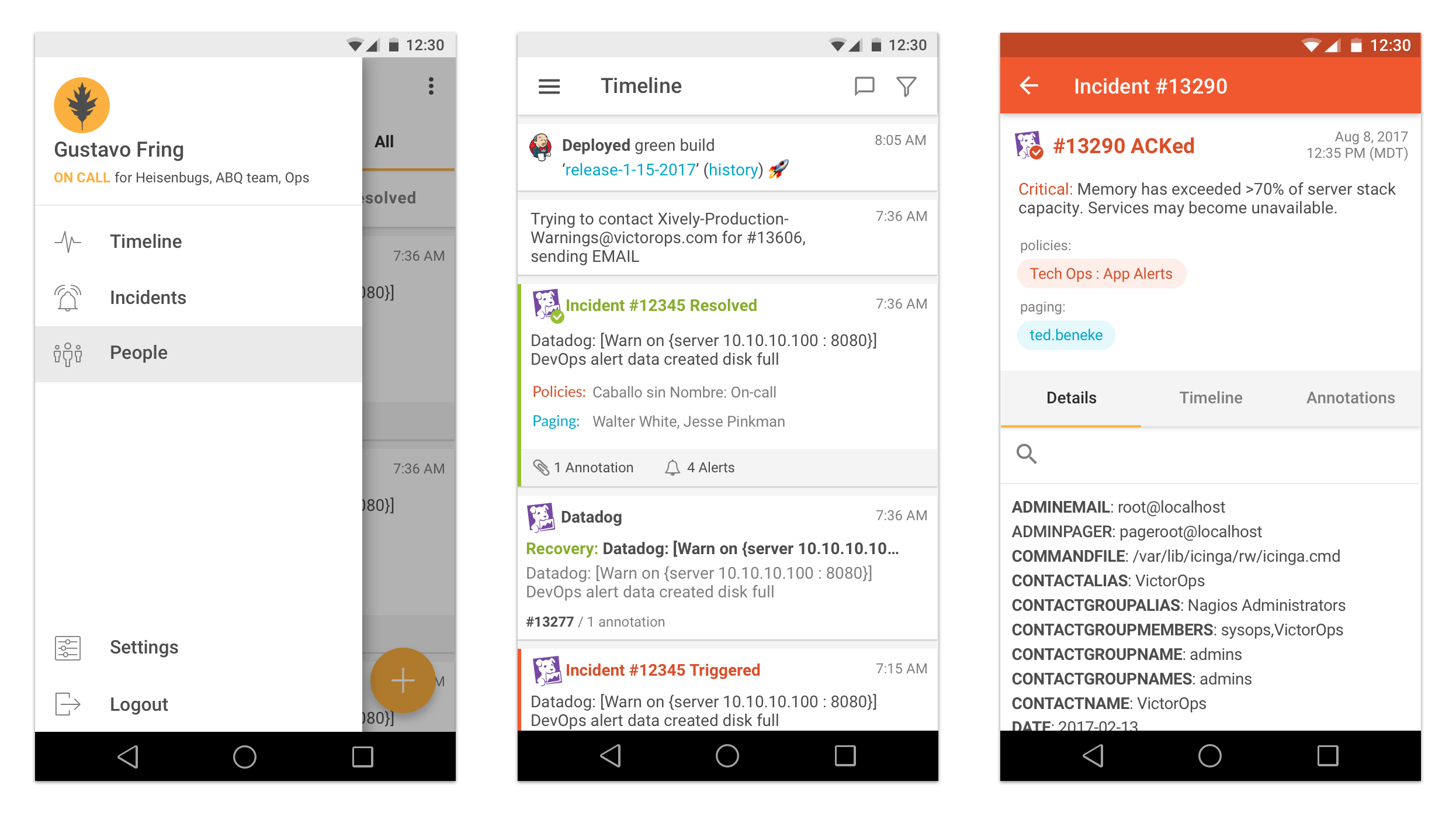
I started by mapping out the major sections of the app important in a "firefight" (where someone is getting bombarded with alerts and needs to remediate problems quickly). I designed a simple nav structure using Material's drawer nav model, which acted as the root for the rest of the navigation.


Sample of the lo-fi wireframes developed for Android
From there I explored how each screen might appear in the app, including aggregate index screens and function-specific details screens.
After having the major functional areas wireframed, I reviewed with the team (and our customer-facing company reps) and moved onto hi-fidelity designs and components.
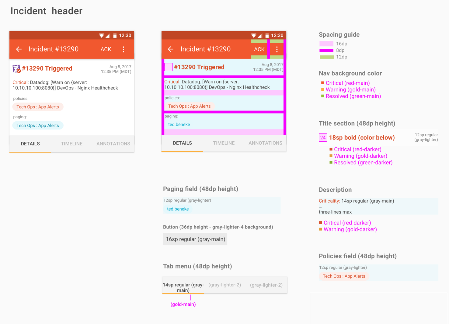
Mapping out components
A guiding principle in any design system is to have common components in our product mapped out and their behavior defined. This not only provides a template and common component library for other designs to work with, but provides low-touch guidance to developers as well.
In our case, this took the form of a hi-fidelity component broken out by section. Each section had specific spacing, color, and font direction.
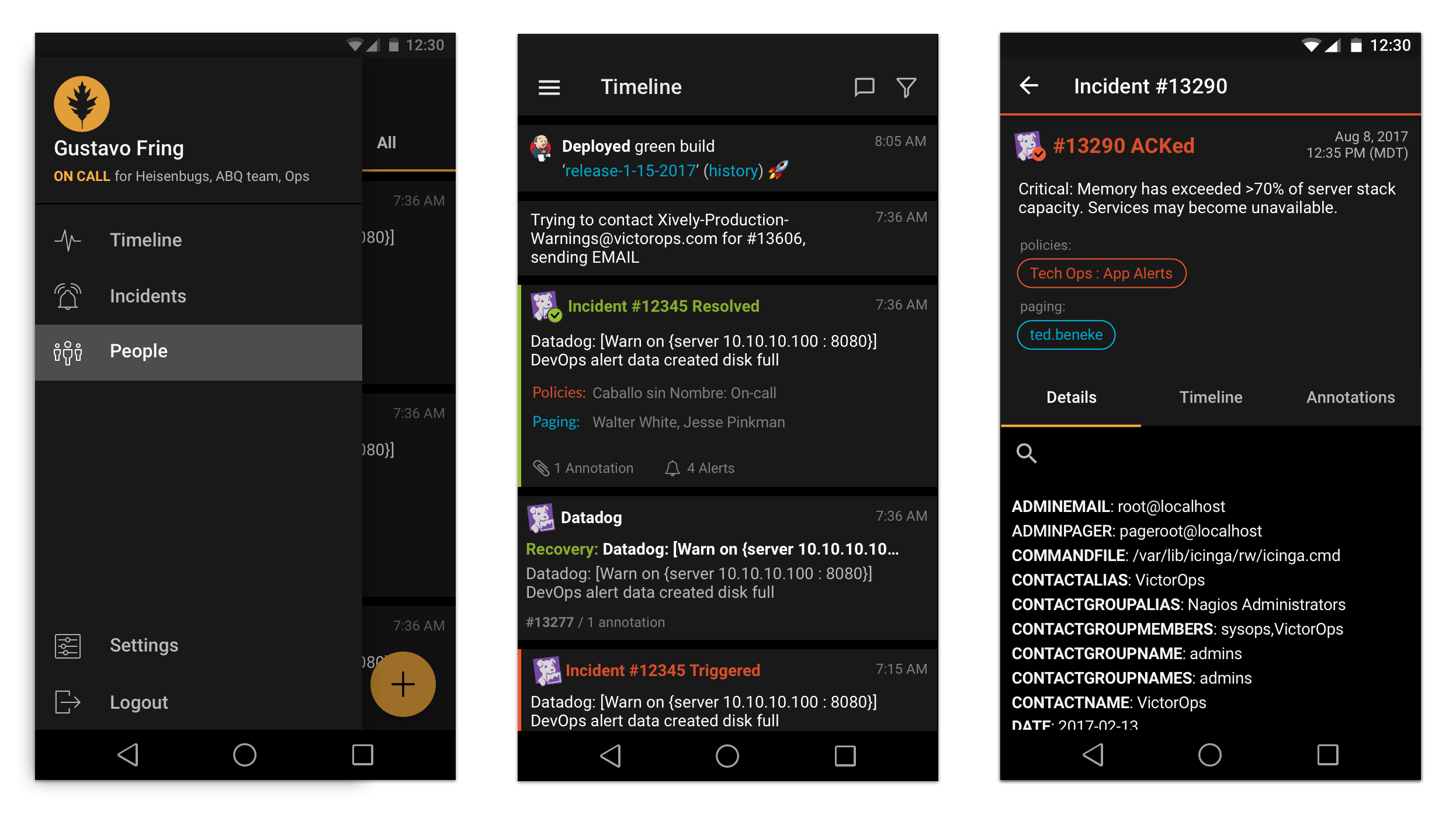
Waking someone unexpectedly in the middle of the night
Since our app was an on-call solution, users would frequently receive an alert that they would have to respond to in the middle of the night. This would mean a combination of digging into alert details, responding to incidents, and rerouting to the appropriate people.
At 1am, a mostly white-themed app is a less-than-desirable experience. To address this, we included a "night mode" which would be triggered by default at times between 9pm and 8am. Users could disable this feature altogether, or enable it all the time (which we found many people did)